
So maybe, just maybe, some of my judgements from my previous Design Star post were wrong. Spoilers ahoy!
I've caught up on the season - the third episode aired last night - and the show is less Mark Burnett-y than it was last season. We're only three episodes in, so this might change, but so far it's been pretty enjoyable. In the first episode, each designer was assigned a partner and a room in their new house to decorate. The designers were paired up by a personal item they brought that best represents their design style and they have to incorporate that item into their room. The second episode was the famous white room challenge. They did all their shopping at a Home Depot/Lowes-type store. In the third episode, the designers were paired up again and each team had to design a room in fucking Kris Jenner's office. Why exactly does she need an office? Doesn't her work just require her and her daughters to work the corner? Fucking LA. Anyway...
Tanika Ray and Candice Olson are not back this season. I never really warmed up to Tanika - Team Clive! - so I won't really miss her, but I think of all three judges, Candice had the most talent. Vern's style I'm neutral about and I do really like Genevieve's style (though I'm not a fan of her sometimes airheadedness), but Candice's rooms are always so polished and elegant.
The biggest surprise so far has been Rachel. Her portfolio looked like the home section of the 1992 JCPenney catalog, but her work these past three episodes has been really good.
Episode 1:


LOVE blue and yellow together.

That wall was all Britany and it's not just painted on the wall. It's MDF she painted white and then attached to the wall.


How cute are these two? The judges over-praised her putting the white moose head in a black square, but that's not her fault.
Episode 2:
Mixing patterns and chevron stripes? I'm in love.
Episode 3:
I love the sofa and chair she picked out. The chartreuse went really well with black, white, and gray. This room is too good for fucking Kris Jenner.
Another pleasant surprise is Britany. I've learned my lesson to not judge a blonde ASU book by its one-T cover.
Episode 1:
LOVE blue and yellow together.
That wall was all Britany and it's not just painted on the wall. It's MDF she painted white and then attached to the wall.
Episode 2:
Love the nautical look.
Episode 3:
Another room that's too good for fucking Kris Jenner. Mikel and Britany make a great team.
Boring Yuki wasn't kicked off for being boring. Quite the opposite actually.
To be fair, Stanley was her partner in eye-searing.
Two things I was right about: Kris is as much of an asshat as I thought and Bex is as annoying as I thought. And conveniently, they were teamed up on the first challenge.
Almost immediately, Kris was a dick to Bex, when she was trying to come up with ideas for the room with him. Kris also had issues working with Miera in the third episode, so clearly he's the problem. His white room in the second episode was based on like wildfires and Austin or something.
I don't know; it's very design student.
So Bex and Luca were eliminated on last night's episode and I would be kind of pissed if fucking Kris Jenner played a part in my elimination. They worked on the showroom. Why the hell do the Kardashians need a showroom?
The judges thought the island and hexagonal shelving were too small for the space. They also didn't like that the art work might distract from...what exactly? The Kardasians Sears clothing line? Honey, none of us should be subjected to that garbage. Luca turned out to be a dick who was pissed that he was the best person in the competition and now he's leaving and everyone who is left is not nearly as talented as he is.
Random thoughts:
- Bex is cute when she doesn't wear those stupid hats.
- Stanley and Luca are both from Pittsburgh and they have the oddest accents. Occasionally they'll sound southern and other times they'll sound Boston-y/New York-y.
- Stanley looks likes the dude from Creed.
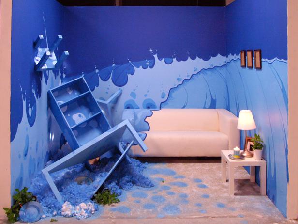
- Ever since season two when Todd turned his white room into that surf scene, which was awesome, the judges have said that the white rooms don't have to be functional. That leads to bullshit like Stanley's:
Todd's room at least still had a couch you could sit on. This is just an ugly art installation. Of course the judges loved it because it was "outside the box." Just because something is ugly and weird doesn't mean it's interesting.
Outside the box yet still in one
ReplyDelete