In 2010 and 2011, HGTV held another housing giveaway, but this time, instead of having to move to a crappy location, like Utah, you got to move to an awesome location, like New York and Chicago. Truth be told, I entered the Chicago Urban Oasis giveaway, multiple times. Spoiler alert: I didn't win. But that doesn't mean I can't judge the apartments and their decor and declare a winner. The 2010 New York pictures will be shown first, in each respective category, followed by the 2011 Chicago pictures. Let's start:
Living Room
Aside from the red carpet, there's really not that much color and those two round tables are too diminutive for the space. I am a fan of a gray, clean-lined couch, though (I have the Ikea knockoff of the pictured couch, I think). Overall, I think this room is too gray and white.
There's color on the wall! And a more appropriately sized table. There appears to be some kind of ransom note on the wall, but that giant prairie-style wall sconce is rad.
Winner - CHI
Barcelona Furniture
I'm not really a fan of brown leather furniture, or leather furniture in general, but a Barcelona chaise is still pretty kick ass and a lot less common than the Barcelona chair.
The black leather Barcelona chair is classic, but pretty standard. Even the dentist office in my apartment building has them. (Not that I would turn one down, if anyone wants to buy me one.)
Winner - NYC
Kitchen and Dining
Kitchen - Standard stainless steel, standard backsplash, splotchy brown cabinets.
Dining - I effing love ghost chairs. If I had my way, all of my furniture would be clear. I think it stems from my love of Crystal Pepsi. And there's a non-tacky chandelier.
More splotchy brown cabinets. The cabinet style seems pretty suburban.
I love a banquette, but I do not like those chairs or that odd eagle thing above the banquette.
Winner - NYC
Bedroom
Were they not allowed to paint the walls in this place? The painted cinderblock-looking wall and the closet doors all seem very utilitarian.
I don't much care for the wall color, but at least it's something. I prefer this comforter and there's a fuzzy throw pillow! There's also enough room in there for a pull out sofa.
Winner - CHI
Bedroom Storage
I love mirrored furniture, dating back to my Studio 54 days. (Sidenote: I was not alive when Studio 54 was open.) But, that's not actually that much storage.
Mirrored trumps wood, but in a bedroom, quantity always trumps quality.
Winner - CHI
Bathroom
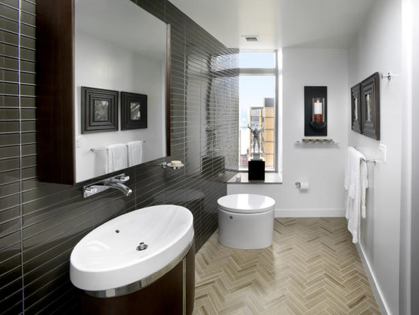
I flove herringbone floors. But, there doesn't appear to be a toilet in the bathroom, just a large wastebasket. The bathroom doesn't have a bathtub either, which is whack.
This place has two bathrooms and a bathtub. That's all you need to know.
Winner - CHI
Candy
All three of those are the candy old ladies give out on Halloween. The table and library print are awesome, though.
Swedish Fish is one of the greatest candies ever.
Winner - CHI
Views
There are a few buildings and a non-great body of water.
There are a lot of buildings, a river, and a great lake!
Winner - CHI
Of course Chicago is the winner of this totally objective contest. Duh.


i'm mostly struck by the fact that there's a dentist in your apartment building.
ReplyDeleteHaha, it's a lot fancier sounding than it actually is. The first floor of my building is store fronts, so there's the dentist, dry cleaners, dog groomers, and one business that lists their hours as "Monday - Friday at our convenience."
DeleteChicago. Correct.
ReplyDeleteHere some well furnished & decorated things i like that very much so keep it up for more post get more details about leather barcelona chair
ReplyDeleteBuy and sell new and used modern, outdoor, office, bedroom and home furniture.
ReplyDeleteChoose from a great selection of gently used furniture for every room in your home.