Designers' Challenge is a grammatically correct show that apparently still airs on HGTV. Who knew? But they appear to only show them once a week at 1:30 and if I'm home at that time, I'm watching Days of our Lives, with the hope that the devil will possess Marlena again.
Designers' Challenge is a show where three boring designers/design teams compete to be hired by boring people with bonkers-sized budgets and mediocre taste - Tuscan, rustic, English or French country, Zen/Asian-inspired.
Then we see the room they want made over.
Yep, that's a pretty awful room.
Chris tells us that Bonnie's budget is $20,000, which is absolutely insane and kind of sickening to spend on one room. Then, we meet the designers.
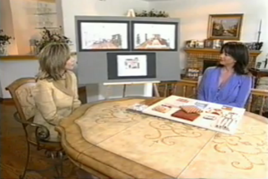
Each designer meets with the homeowner to show her their design plans.
Designer #1
The designer and homeowner then go shopping together to pick out the fabric and finishes. All of that fabric is horrible.
And that's the main problem with Designers' Challenge. They always just look like average rooms. Where's the fun in that? One could argue that my girl crush Sarah Richardson also spends an insane amount of money on the homes she renovates, but the big differences are that she generally guts the homes and everything - plumbing, walls, flooring - has to be redone and her stuff is at least colorful and creative.
The other problem with Designers' Challenge is the same as the problem with Room by Room: the designers they showed on HGTV in the 90's were just shitty. I mean, I love the 90's - Bill Clinton, alternative music and gangsta rap, silver mini-backpacks - and I still think the fashions from seasons two and three of 90210 hold up today, but like everyone at that time was doing heroin and decorating their homes terribly. I think that with the increase in internet accessibility and Ikeas since then, people have really stepped up their games. You can get cool decorating ideas from other people with better taste and you can buy inexpensive, modern furniture that is cheaper and way better looking than your crappy sectional from JC Penney. But, who knows? Maybe we'll be saying the same about Sarah Richardson fifteen years from now.
The show was hosted by The Bachelor's Chris Harrison before he was The Bachelor's Chris Harrison. But you know who I think would have been a better host? 1990's E! personality Todd Newton. He had the same non-threatening, brown-haired good looks as Chris Harrison, but is more engaging. Anyway, not-Todd Newton Chris Harrison only really had to talk for five minutes total per episode while sitting in front of a green screen. The flying circles and hexagons were added in post-production.
So, in each episode, we're introduced to the homeowner, in this instance, Bonnie, first.
So, in each episode, we're introduced to the homeowner, in this instance, Bonnie, first.
Then we see the room they want made over.
Yep, that's a pretty awful room.
Chris tells us that Bonnie's budget is $20,000, which is absolutely insane and kind of sickening to spend on one room. Then, we meet the designers.
What kind of mediocrity do you have in store for us today designers?
Those are some pretty homosexual topiaries.
Each designer meets with the homeowner to show her their design plans.
Designer #1
I hate, hate, hate hardwood floors placed on the diagonal.
Designer #2
Designer #2
This guy says he likes to be "kind of hip and fun," which pretty much means he's neither.
Oh look, the furniture is placed on an angle! That is hip and fun!
Designer #3
Designer #3
This gal added non-functioning drapery, which I hate only slightly less than diagonal hardwood floors.
Once the three designers have presented their ideas, the homeowner has to decide which one she'd like to work with. Bonnie picks designer #1, Yvonne.
Once the three designers have presented their ideas, the homeowner has to decide which one she'd like to work with. Bonnie picks designer #1, Yvonne.
Now it's time for the big reveal!
And, honestly, does this room really look like it's worth $20,000? No, it doesn't. They never look like what they actually cost. To wit:
$25,000.
Also $25,000.
And that's the main problem with Designers' Challenge. They always just look like average rooms. Where's the fun in that? One could argue that my girl crush Sarah Richardson also spends an insane amount of money on the homes she renovates, but the big differences are that she generally guts the homes and everything - plumbing, walls, flooring - has to be redone and her stuff is at least colorful and creative.
The other problem with Designers' Challenge is the same as the problem with Room by Room: the designers they showed on HGTV in the 90's were just shitty. I mean, I love the 90's - Bill Clinton, alternative music and gangsta rap, silver mini-backpacks - and I still think the fashions from seasons two and three of 90210 hold up today, but like everyone at that time was doing heroin and decorating their homes terribly. I think that with the increase in internet accessibility and Ikeas since then, people have really stepped up their games. You can get cool decorating ideas from other people with better taste and you can buy inexpensive, modern furniture that is cheaper and way better looking than your crappy sectional from JC Penney. But, who knows? Maybe we'll be saying the same about Sarah Richardson fifteen years from now.


Modern Furniture started when the owner, wanted to furnish his downtown loft in Los Angeles with affordable modern furniture.
ReplyDeleteIt would be interesting to see how these forgotten shows compare to current design trends.
ReplyDelete